In the intricate B2B industry, your website’s design can make or break your marketing efforts.
Most site visitors form an opinion about a website within the first 0.05 seconds of seeing it. That’s a tiny window to make a good first impression.
If your site looks haphazard and low-quality, it can create the impression that your company doesn’t take its business seriously. Worse still, some visitors may assume you aren’t trustworthy and take their business elsewhere.
Given the above, what measures can you take to ensure your site looks presentable? You can follow several website design best practices.
This article reveals ten website design best practices to keep in mind when designing your B2B site. By the end of the article, you should have all the knowledge you need to design a high-converting B2B website.
A B2B website's branding comprises all the visual elements that set it apart from its competitors. These elements include its logo, font, text, images, colors, and so on. Similarly, domain names, brand voice, and even font styles can play a role in branding.
Consistent branding is, hence, key when designing a B2B website as it creates a sense of familiarity, which is reassuring to discerning B2B customers.
According to a report by Lucidpress, consistent branding can increase a company’s revenue by 20%. In contrast, an inconsistently designed website can confuse visitors, compelling them to bounce from your site.
Your site should maintain a consistent color scheme and font across all its pages. In the image below, Incorta’s homepage and About Us page maintain a consistent look and feel:
It helps to make decisions about font and color choices before entering the design phase. Regardless, your decision should help position your brand in your customer’s minds.
Also, keep accessibility standards in mind when designing. The accessibility standards set by the World Wide Web Consortium are a collection of design guidelines that list four main principles or design standards every website should follow. Let the below-listed principles guide your design decisions:
Keeping the above principles in mind will ensure your site is accessible to all users.
One of the most essential B2B website design best practices is ensuring that your site’s design is clutter-free.
Visual clutter hurts your site’s user experience. Too many design elements on the page overwhelm visitors, while a lack of visual hierarchy confuses them.
The solution is to take a minimalist approach when designing your B2B website.
B2B and e-commerce websites employ minimalist design conventions to provide a clutter-free browsing experience.
That means using screen space (including white space/negative space) and asymmetrical design effectively for a clean aesthetic. Mercury Bank’s website below is an example of a website with a clutter-free design:
The aesthetic is clean, simple, and pleasing to the eye, with minimal text and decent spacing.
Your B2B site needs to be navigable to drive conversions, and that entails providing your visitors with a frictionless browsing experience.
Aim to make it easy for visitors to locate the information they need in as little time as possible. Otherwise, you risk driving them away and losing their business forever. You can:
Plaid’s website (below) uses hover effects on their navigation links to let visitors know they're clickable:
Regarding your site’s navigation bar, ensure the list of links included leads to pages your customers will likely seek out. Examples include links to product/service explainers and company information (as in the image below).
Also, make your logo clickable, as visitors may expect to return to the site’s home page when they click on it. And avoid crowding a content-heavy site’s navigation bar with links.
Instead, incorporate some links into the navigation via dropdown menus.
Ultimately, your website exists to encourage a potentially profitable user action, like a sign-up or app download. Prominent calls-to-action is how it’ll meet the above objective.
Ensure you incorporate call-to-action buttons into your web design process. They’ll convince your site's visitors to take the desired action.
You can make a call-to-action button stand out by giving it a different text and background color to the other content on the page.
For example, the website in the image below draws the visitor's attention with an unmissable blue call-to-action button.
Also, keep your call-to-action text concise, possibly between one to three words. Concise call-to-action examples include "Get a Quote" and "Register."
A responsive website is one whose design changes depending on the screen sizes it’s viewed on. For example, a site accessed via a mobile screen may show a clickable hamburger menu, whereas desktop users will see all the links in a full horizontal menu bar.
See Adobe’s site below:
Considering that over half of web traffic worldwide comes from mobile devices, designing a mobile-friendly website is a non-negotiable design consideration. If you want to keep your website’s bounce rate low, it has to look good on mobile screens.
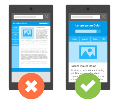
Without a responsive design, you risk giving mobile visitors an unpleasant user experience. Elements may appear squashed together, too tiny to be read (as in the image below), or run off the page. In other words, your site will look unprofessional.
Therefore, ensure that your site looks its best on all devices. Using a responsive WordPress theme or taking a mobile-first approach when designing your site are two measures you can take to ensure your B2B site is responsive.
Also, the best website and landing page tools create mobile-ready website designs. So you may want to invest in them.
Social media is vital to your inbound marketing plan. Your target market likely spends roughly 147 minutes daily on social media platforms. As such, including social media links on your website should be a no-brainer.
Social media icons can encourage your site’s visitors to connect with your brand on their favorite platforms. Visitors can follow your brand on sites like Instagram and Facebook and get updates about your offers directly in their feeds.
For example, if you maintain a money-making blog, social media sharing buttons can help you spread your content quickly.
You can place social icons anywhere on your site. Your choice of positioning depends on whether you prioritize converting visitors to followers on social media sites.
The most common place to put social icons is in your site’s footer section, as in the image above.
Unfortunately, people’s attention spans aren’t what they used to be. According to a 2019 Technical University of Denmark study, our collective attention span is narrowing. The cause: an abundance of information.
As such, it isn’t wise to inundate your B2B site’s visitors with walls of text. Instead, consider using high-quality images to convey the benefits of your product or service, as below.
Some strategies worth trying include:
In summary, use more images to make the site and copy more engaging. Your visitors will stick around and get your message loud and clear.
While working on your B2B site’s aesthetics, optimizing the design for search engines should be a priority.
When learning about search engine optimization (SEO), most people initially think of backlinks and keywords. In reality, search engines rely on hundreds of factors when recommending sites to potential customers. From a web design perspective, some of these factors may include the following:
Getting favorable SEO results requires adopting a holistic view of your B2B site’s design. Don’t focus too much on the aesthetics of your web design, and ignore SEO. A website is only helpful if it attracts visitors.
An SEO-friendly hosting provider can help with page loading speed. There is no doubt about that. However, your B2B website design choices can impact your site’s performance. And if your site loads slowly, visitors may click away, increasing your site’s bounce rate.
Therefore, adopt the following measures to improve page load speed:
Of course, the above measures are just a few of many. Others not mentioned include reducing redirects, compressing images, caching web pages, and using a content delivery network.
Website design is a continuous improvement exercise. Therefore, expect to tweak your B2B website’s design for the foreseeable future.
However, rather than making adjustments based on your personal preferences, they’ll be in response to visitor behavior. And A/B testing is how you gather the data needed to improve your site.
The idea behind these tests is to compare two designs (the A and B in A/B testing) to see which one performs better. You can test almost all the visual elements of your website. Examples include:
Running these tests will help you understand which B2B site design resonates better with your visitors. You can compare how long people spend on one site versus the other, which call-to-action copy got more clicks, etc.
Finally, A/B testing can help you develop templates if you adopt an adaptive web design process.
To recap, your B2B site should be navigable, responsive, clutter-free, and, where possible, use images to enhance understanding. Incorporate calls-to-action on your pages. And pay attention to SEO and loading speed.
Also, conduct A/B tests, maintain consistent branding, and include social media buttons. They’ll help visitors connect to your business off-site.
When you incorporate these design best practices into your design to-do list, you’ll have a high-converting B2B website in no time!
Matt Diggity is a search engine optimization expert and the founder and CEO of Diggity Marketing, The Search Initiative, Authority Builders, and LeadSpring LLC. He is also the host of the Chiang Mai SEO Conference