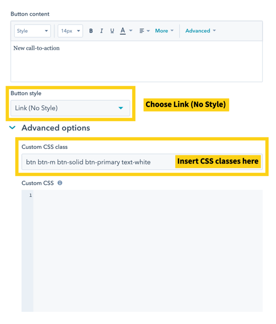
Hatch comes with reusable button CSS classes that we can use to style HubSpot CTAs.
The following classes allow us to customize a HubSpot CTA's shape, style, background color, and text color. They're used in combinations.
Button Shape
All buttons require btn class to control the basic shape.
Button Size
- btn-s
- btn-m (optional)
- btn-l
Button Style
- btn-solid
- btn-outline
Button Background Color
- btn-primary
- btn-secondary
- btn-tertiary
- btn-warning
- btn-danger
- btn-success
- btn-dark
- btn-light
- btn-white
Button Text Color
- text-primary
- text-secondary
- text-tertiary
- text-warning
- text-danger
- text-success
- text-dark
- text-light
- text-white
Usage
When creating a new HubSpot CTA, choose Button style = Link (No Style)
Then, insert the CSS classes from above into the Custom CSS class box.